@xds/theme-default0.0.13
1. Install the theme
bash
2. Import the built theme
typescript
3. Wrap your app
tsx
Little joys,
everywhere you goWe believe the smallest details are the ones that matter most. Turn an ordinary day into something worth remembering.
everywhere you goWe believe the smallest details are the ones that matter most. Turn an ordinary day into something worth remembering.

| Name | Description | Price | Stock |
|---|---|---|---|
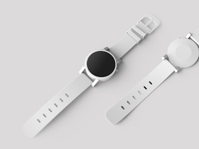
| Minimalist Watch | Stainless steel, sapphire crystal | $189 | 42 |
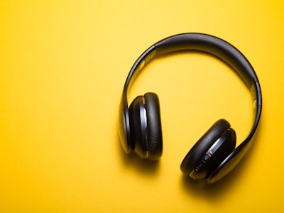
| Wireless Headphones | ANC, 30hr battery | $249 | 128 |
| Leather Wallet | Full-grain, RFID blocking | $79 | 15 |
| Canvas Backpack | Water-resistant, 25L | $119 | 63 |
Clean, professional default theme. Uses Heroicons icons.
Install
bash
Usage
Wrap your app with XDSTheme and pass the theme:
tsx
Import paths
| Path | Use case |
|---|---|
@xds/theme-default | Source build (StyleX compilation via @xds/build) |
@xds/theme-default/built | Pre-built dist (Tailwind, plain CSS, or no build step) |
@xds/theme-default/theme.css | Pre-built CSS file (import in your stylesheet) |
If you're using @xds/build for StyleX source compilation, import from the bare path. Otherwise, use /built.
CSS import
Add the theme CSS to your stylesheet:
css
This is required for component-level theme overrides (colors, radii, typography) to take effect.
Related Packages
| Package | Description |
|---|---|
@xds/core | Core components and theme system |
@xds/build | Build plugins for StyleX source builds |
@xds/cli | CLI tooling including xds docs theme |